Category Archives: Instructional Design

Guiding Questions for Improved Community Engagement

This is the work of Dolly Joseph, and should not be used without express permission and compensation.

Before Engagement

Before heading into a community– for an internship, volunteering, seeking employment, whatever, it’s a good idea to situate yourself in relationship to the new project. 

Feelings

Check in with yourself about how you are feeling– nervous, excited, timid, enthusiastic, apathetic… It’s okay to feel one or all of those feelings, and it’s also important to think about how the display of those feelings might be received by the community member(s) that you’ll be interacting with. 

  • What am I bringing to the community? 
  • How may I be received by this community? How do I feel about that? 
  • What will be challenging? What will be easy? 

Skills

It’s also a good moment to take a skills inventory of yourself. What do you feel like you know how to do well? What could stand some improvement? What skills are you hoping to practice or develop with this opportunity.

  • What am I bringing to the community? 
  • What relevant skills do I have? Is that enough? Where should I grow? 
  • What am I expecting to get out of this interaction? 
  • What am I expecting the community to get out of this interaction? 

Information

It’s important to understand the context of the community that you will be engaging with. Do you have the needed information to engage in a positive manner? Have you gathered information from trusted, accurate sources? 

  • What am I bringing to the community? 
  • How have I educated myself about the community? 
  • What assumptions have I made? Are those fair? 
  • What expertise already exists in this community? 

Resources

Resources can cut across these 3 categories– Resources can be related to access to information, time, money, emotional labor, etc. Often when we do community engagement in the form of volunteering we forget about the resources that are required to accommodate us as volunteers. It’s incredibly important to consider how resources are used when we engage with the community.

  • What am I bringing to the community? 
  • What is the balance between what I will bring to this community (skills, open-mindedness, readiness to work, etc.) and what I will take (time, energy, etc.) 
  • What is the community [giving/sacrificing/risking] by hosting/partnering with me? 

During Engagement

While you are within your community engagement, it’s important to consider how things seem to be going– both good and not-so-good. Remember, none of us are perfect. Often we get into the trap of thinking that there is no room for error. You will make mistakes, and then grow and learn from that practice. Reflecting and adjusting during your community engagement is a great way to improve your current and future experience. 

  • Am I effectively paying attention to direct and indirect communication? 
  • Am I engaging in effective, positive and/or productive interpersonal interactions? 
  • Am I using my skills in an appropriate, effective, and respectful way? 

After Engagement

Even if your most recent community engagement was a “one off” commitment, you will have another experience in your future. It’s important to reflect on how things went so that you can be more effective next time. 

  • How do I know if my interaction was a positive experience for the community? 
  • How did my expectations differ from what happened? 
  • What should I do to have a positive and productive experience next time? 
  • What skills or resources should I access to improve my effectiveness?
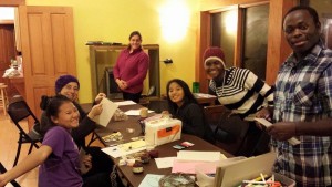
Building Experiences Youth Conference 2015

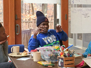
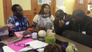
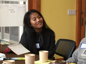
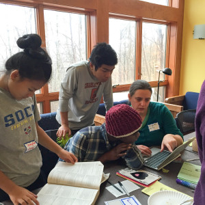
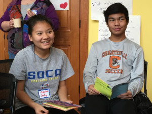
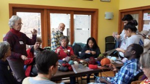
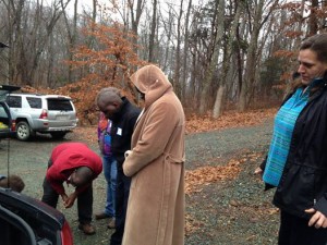
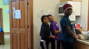
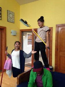
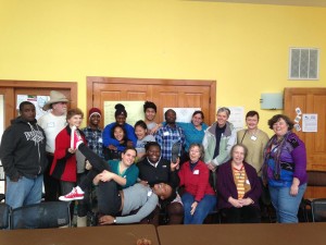
This past weekend we had an amazing time at the first ever BE Youth Conference. Over 3 days 11 youth and 15 adults, one baby and one falcon came together to:

  • Make pizza
  • Bind books
  • 10891934_10205948761945270_1854783206660880486_n
  • Design a personalized flag
  • Set goals and expectations
  • 10897083_10205948764105324_7114031788607864172_n
  • Discuss college and career
  • 150103-0435

    With Permission from Peggy Harrison

  • Share life stories
  • 10917297_10205948784025822_8543576272578278067_n
  • Explore available scholarships
  • 150103-0409

    With Permission from Peggy Harrison

    150103-0443

    With Permission from Peggy Harrison

    150103-0402

    With Permission from Peggy Harrison

  • 10898210_10205948775065598_6616167356019678992_npixel (4) pixel (3) pixel (2) pixel (1) pixel
  • Learn to knit and crochet
  • 10917309_10205297771220847_508034615138598994_n
  • Begin saving for the new year
  • Learn about car maintenance
  • 10408728_10205297771300849_4663716593044087324_n
  • Share meals
  • 10915231_10205948763105299_6143350829842027119_n
  • Hold a falcon
  • 10905997_10205297771340850_498779582771180810_n
  • Meet new friends
  • 10390528_10205297894503929_978074711424628580_n
  • Share cleaning responsibilities
  • 10344765_10205297767740760_2472665308418544499_n
  • Hug and Laugh

It was magical.

10906187_906673586010163_8353774012257728863_n

Thank you to Peggy Harrison for sharing her photographs.

Encouraging Personal Growth through Scavenger Hunts

Building Experiences is holding a Youth Conference in January and we’re hashing out the structure of the weekend. One student has been vociferously requesting a scavenger hunt so I’ve been trying to figure out an authentic way to include her request in the weekend’s agenda. The scavenger hunt is still in development, but here are some creative ways that I’ve been thinking about modifying the structure:

Continue reading

The Rookie’s Guide to Ed Theory: Bloom’s Taxonomy

Guess what? You’re probably training someone right now! Are you a shift manager at a restaurant, are you a parent, or will you be working alongside a new hire? Yes? Trainer, trainer, trainer!! This is an occasional series to introduce you to important educational constructs.

Bloom’s Taxonomy
or It’s more than just “understanding”

Bloom’s Taxonomy http://cft.vanderbilt.edu/guides-sub-pages/blooms-taxonomy/ is “a framework for categorizing educational goals”. When I was beginning education grad student, I thought the goal of every lesson was for learners to “understand” stuff. “You know, I don’t know, students will understand that the civil war was really important, for, you know, everyone in the south after it was over.” That’s some pretty content-free stuff right there, which is pretty much how my first teaching attempts went. Continue reading

7 Steps to Designing or Modifying Objective-Based Activities!!

This past Thursday I was lucky enough to get to present at the NASAGA conference in Baltimore. I’ve been involved with NASAGA since 2004 when I got introduced to this wonderful group of trainers, teachers, and designers. I’d really suggest attending next year’s conference in Seattle if you are wanting an infusion of creativity and inspiration.

This presentation came from seeing the disconnect between activities, learning objectives and evaluation in much of the training that I see. I want to see better matches between what we are teaching and how we are evaluating learner’s performance.

While these are presented as 7 discrete steps, it’s likely that a designer would need to revisit earlier stages to make adjustments as needed.

Determine the Goal

This is the big picture goal. Examples include: Students will develop their reading skills or The team will build stronger relationships. These fall within a continuum that could be goals for 6 or 60 year olds.

Identify Required Prior Knowledge/Analyze the Learners

First the designer must determine where on that continuum the learner lies. Letter Name recognition or college-level comprehension? Are these sales associates just beginning their careers, or are these executives selling at the enterprise level? There are tons of cultural, cognitive, language, developmental factors that you need to be aware of as you design effective learning activities. So who is our audience? And what do they know?

identify Realistic Objectives for the Length of Session and Audience

This is where the designer decides what specific things our participants will be learning or doing. Objectives are performance based and verb-oriented. Some examples of objectives are:

  • Recall and state the 50 state capitals of the USA, or recall and state the features of a Ford 150 pick up truck
  • Compare and contrast the features of two competing products
  • Use proper placement and form while running
  • Create a personal goal statement
  • Improve confidence in ability to perform

Choose Performance Benchmarks

How do we “grade” our learners? Too often I see scores of multiple choice being the only way we measure learning, when in actuality we really want to know that they can perform tasks in the workplace, or that they are building foundational skills. We do need numbers, or qualitative rubrics, or rated rubrics. I’m enough of a pragmatist to know that we need reportable outcomes to funders– whether they’re our state governments, or donor or our managers. Here are some ways that we can describe performance benchmarks:

  • Correctly spell 8 out of 10 words.
  • List at least 5 differences between 2 products
  • Match at customer attributes to the best available product
  • Run a mile in 10 minutes or less
  • Create one software routine that can correctly manage user input

Scale Story and Time to Create a Metaphor

The most effective training takes an authentic real-life performance task and scales to the “classroom” so that the class performance most closely relates to what the learner will need to do out in the world. The prime example of this kind of emulation is a simulation– Military video games, or NASAGA member Chuck Petranek’s drinking game. While a video game can give us amazing immersive graphics, it can be as simple as having a chip represent an alcoholic beverage. Sometimes metaphors can become belabored and unwieldy– and the focus becomes on replacing the relationships. We want to have stories that are simple and support the learning objectives– It certainly can be tempting to provide overly complex stories, but scaling back and focusing on the learning objectives helps focus on the important stuff, not building overly elaborate fancy worlds.

Develop Participant Activities

Activities can be individual, team, face to face, online, merged, games. We have whole arsenals available to us. We can do a better job of convincing our stakeholders to use a variety of activities when we can clearly connect them to learning outcomes.

Select Debrief Techniques

How many times have evaluation at the end of a course devolved into a certificate of completion for the student, and a survey for the instructor? That’s not enough .One of the ways that gamification can really be effective is providing a more compelling feedback loop– badges can be great motivators, and can track varying levels of mastery. Points boards can be used effectively (and carefully) to foster competition. BUT, this is only the beginning. If I had my druthers, we would see more integration on training and feedback into the workplace, or school setting. People often see training outside of their workplace performance, and really, it would be good to tie annual reviews/reflection all of the rest into our training.

Daily Dining Simulation

A number of years back I observed that my class of 8th grade girls seemed to be more worried about diet and weight than they had been in years previous. I contacted my good pal Chuck to see what he thought about creating a simulation that dealt with anorexia and eating disorders. I had the pleasure of meeting Chuck at a NASAGA conference and had participated in The Drinking Game and Alzheimer’s Disease: A Grieving Loss Simulation, both powerful, inspirational group activities.

As Chuck and I worked on the Daily Dining Simulation over email and phone exchanges we adjusted the focus, and instead focused eating patterns broadly, and created an activity that we successfully presented at NASAGA and that Chuck now has for sale on his site.

Creating this experience with Chuck reinforced some beliefs and taught me new lessons as well.

Simplify your Symbols

Much of what we do as designers is to boil messy complicated real life down into some translatable activities. As we selected meals for participants to dine on, it was tempting to become overly solicitous. Should breakfast include oatmeal AND granola AND cold cereal? What about sausage versus bacon? And so on… The point was not to provide every person with their favorite meal, but it was to provide representations of breakfast choices.

Reality can be Misrepresented

Momentarily as we designed, I got caught up in making sure that the calories of the foods selected were represented accurately. But then I remembered that the point wasn’t to represent calorie-counting, but instead to look at broader patterns of eating. It didn’t matter if one chip represented 100 calories, or if chips represented both calories or pounds. What mattered was if we could tell a story that chips represented something about your behavior.

Timing is Everything

The pace of an activity can make or break it. In this case, participants had certain assigned tasks to complete in a small timeframe which required concentrated effort, but there were also downtimes where participants had time to reflect, as well as interact with the other participants. There was variability of pace built into the flow of the activity, making a 90 minute-long session seem much shorter.

Choice, and the Choices Made, is Critical

There was plenty of opportunities for participants to make choices– in the foods they selected, how they chose to spend their downtime, whether they “cheated” or not. But that there were choices wasn’t the interesting part, it was more interesting what choices participants made, and what that revealed about themselves.

Concentrate on the Objective

Whenever the debrief conversation delved into how the simulation deviated from reality, we returned the conversation to the metaphor we were constructing… “So yeah, YOU typically eat granola in the morning and we didn’t have that choice… Were you able to find a substitute for that food? And did your eating patterns in the simulation reflect your real life eating patterns? Oh, okay… Does that make you think differently about your eating patterns?” It’s critical that as a facilitator, you keep the conversation focused on the objective, not on the details.

While these were lessons gained from a simulation, I think that they are applicable to many other kinds of educational activities as well. Please check out Chuck’s great simulations.

Instructional Design 101: Content Analysis

Quick: What are the fundamentals of Instructional Design?

In your list, did you include content analysis? So much of the time we’re so intent on figuring out tools, audience needs and evaluation that clear and understandable content is overlooked. Often, the contract work that Brandon and I did would have a large unplanned and un-budgeted component of deciphering content provided by the client. We would often be asked to design instructional materials when the content was both repetitive and incomplete. One such case was a credit card compliance training for managers of fast food franchises. We used the following techniques to make 55+ PowerPoint slides into an effective interactive learning experience.

Read for Purpose

The first read-through of instructional material requires switching between in-depth and surface reading. You’re reading for purpose– as a learner, digesting information and checking for gaps in the material — as a designer, you’re already preparing the best way to parse and re-arrange the material for understanding. This requires both deep concentration on details to ensure you grasp the content, and taking a big picture view to make sure there is an understandable context.

Identify Frameworks

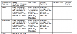
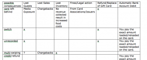
Typically during the first few read-throughs, certain patterns emerge. Hidden within a linear narrative, we identified 8 distinct types of credit card fraud that the manager had to understand. Each type of fraud had a set of consequences, preventative measures, and follow-up procedures. There was a lot of content to grapple with both as a learner and a designer. We constructed tables to house data on fraud type and consequences, and fraud type and preventative measures to ensure that all content was transferred from the narrative content to our game-based activity.

Categorize Content and Identify Outliers

It can take multiple analyses to ensure that a framework accommodates all of content. It may be necessary add more categories, and/or combine others. Sometimes content simply won’t fit inside a framework– sometimes it is extraneous, and therefore excluded, and other times it’s critical for legal or compliance reasons. In this case, we found that securing the restaurant’s computer network was a measure that was useful in preventing only one type of fraud, a data breach. Accordingly, we were to sure to emphasize this measure in the applicable module.

Screen Shot 2014-08-25 at 10.52.06 PM

Identify Repetition and Commonalities

As we looked at the source PowerPoint slides,  we realized that there was a lot of repetition in 3 categories: consequences, preventative measures and steps to follow after an incident. Using tables helped us identify the shared traits AND the dissimilarities. Knowing the commonalities between the fraud types helped us in framing our instructions and influenced our use of predictable structure (discussed below) in making sense of the large amount of content.

Screen Shot 2014-08-25 at 10.52.39 PM


Check in with SMEs

When doing a major re-organization of material, it’s important to ask for clarification and confirmation from your Subject Matter Experts. This is an opportunity to make sure that your assumptions and logical leaps are valid. By checking with the SMEs, we were able to confirm that most of our assumptions were correct, and they provided further helpful clarification. As you’re rephrasing to fit your narrative, you want to ensure that your language is still precise, and in the case of compliance-related instruction, ensure that it’s legally correct.

Use Predictable Structures

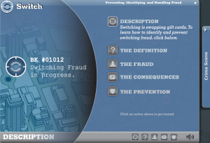
Most learners do best when there is some predictable structure that can help them make sense of material. Once we figured out the pattern of the material, we didn’t hide it from the learner. We explicitly structured our material around the pattern that allowed us to understand the complex, multi-step material. Each of the 8 modules described the fraud, gave a brief illustrative story of the fraud to frame context, and presented the consequences and the prevention.

Screen Shot 2013-01-13 at 12.08.32 PM


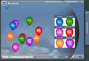
The same activity was used throughout each module to reinforce the commonalities of the consequences.

Screen Shot 2013-01-13 at 12.51.57 PM


Recognize Limitations

We were hired to do a fun, interactive game, and we delivered. But this was compliance training, and we realized that there were some very important procedural tasks that managers would have to do if they were unlikely enough to encounter fraud. We realized that having them enter a Flash game and hunt for procedures was not the best fit. We created a stand-along document with step by step instructions from corporate. There was no need to force this legal, procedural document into our crime narrative.

I find that a thorough, structural, content analysis allows me to feel confident that I have accounted for all my data, and therefore I can be creative and free when it comes to creating games and the interface.

EpiCroqueTournament

EpiCroqueTournament

I love designing and playing games, and I love hosting parties. For a large friends and family party I wanted to design something unique and fun for the guests to do. Just like when I design a learning game, I went through a fluid, yet familiar design process.

Objectives

  • All-ages play
  • Easy to follow rules
  • Everyone feels successful
  • Play would take about an hour
  • Play would result in exploration of the family property

Process

photo

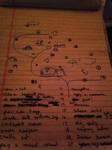
As I begin a design, I think about 2 major pieces– what are my resources and what should the participant gain. The Joseph Compound is rife with stuff– how could I use it to make a fun experience. I knew that we had tons of partial croquet sets around, but I knew that I didn’t want to play traditional croquet. There was too much structure– turn-based, winning and losing, a standard wicket set-up… It was important to establish that this was nothing like croquet. I took inspiration from the board game Cranium where players would perform different tasks within drawing, singing, acting, etc. As players hit the ball through a wicket, they would perform a fun task that was described with a poem. The task took away the focus on the traditional counting of strokes, and instead focused on the satisfying smacking of the ball by the mallet, strolling about the grounds, and laughing with one another as shared silliness abounded. Without the competitive element, people could opt out of any activity that was uncomfortable to them.

Hole Number Task Materials Needed Notes
1 Wear a Hat Hats! I purposefully began the course with this task. I figured everyone loves a hat, and that this low-stakes entree into the game would allow people to ease into the spirit of the game.
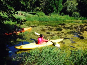
 2  Go Boating  Boats and a body of water photo 3 (1)
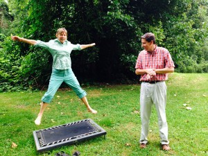
 3 Get “Physical”photo 3  Trampoline and Antique Treadmill Olivia Newton John sang it,
“Let’s Get Physical”, she proclaimed it.
Hop on that treadmill with your feet, not your eyes
Jump on that trampoline for some exercise.
 4  Horseshoe ringer Horseshoes set You’ve made it underneath the hornet’s nest.
Don’t worry, they’re long gone, not to molest.
Take a care to each finger.
As you, with a horseshoe, make a ringer.
 5 Easter Egg Hunt  Easter Eggs Rabbits give live birth
That’s why they have such wide girth
They also don’t have a chicken beak
Why then, to them, we ascribe an Easter season hide and seek?
 6  Dribble a ball between your legs Basketball  There’s the basket, here’s the ball
Bounce that sucker tween your legs, don’t you fall
 7  ABCs with your body  Body doll for demonstration  You’re about halfway through the course
Don’t be fussy or too snotty.
We’re not gonna use the code of Morse,
Spell your name using only your body.
 8  Play a musical instrument  assorted musical instruments  In the country you can make a blat
Of a bugle or a drum splat
Loud enough to attract a herd of cow
Bonus points if the coyotes howl
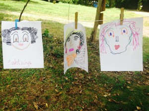
 9  Draw your self-portrait  paper, pencils, markers, clothesline photo 2 (2)
 10  Rock Sculpture  rocks  photo 3 (2)
11  “Archaeological” Dig  broken dishes, hole  photo 5
 12  Junque Sculpture  assorted oddments  Whew, you’ve made it to the highest wicket
Take a moment to enjoy the view, that’s the ticket
Now look around at the plaster, wood and metal parts
Turn it into an arrangement of art
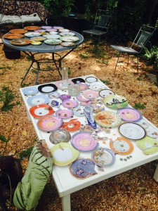
 13  Coin toss  coins, dishes, table photo 1 (1)
 14  Talk to a goat  goats  Do not buy goats only to play EpiCroqueTournament.
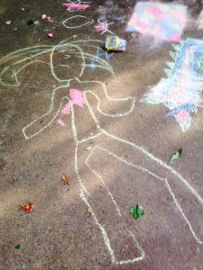
 15  Sidewalk drawing chalk, pavement  photo 1 (2)

Results

Over the course of two weekends, about 40 people played EpiCroqueTournament. It exceeded all of my expectations– including getting positive reviews from two of the most demanding critics, my older brother and first cousin, neither of whom are easily satisfied. Players laughed, got engrossed in activities, ventured further afield than the food and drink stations. Some players went on a boat for the first times in their lives.

Lessons I would take away are:

  • Fun and enthusiasm in design translate to the playing experience. I talked up the game in social media, even tho it wasn’t completed. People came ready to play because I was.
  • Editing is ALWAYS good. I deleted several activities which were simply too much work for me, were too complicated to perform or weren’t seeming fun.
  • Use what you have. The particular working parts of EpiCroqueTournament fit into a paper bag. There are a lot of other materials that I brought to the game, but they were mostly already on the landscape. Granted, we’ve got a lot of weird stuff, but I bet you do too.

photo 2

When Multiple Choice is Just Not Enough (Anatomy of a Bad Assessment Item)

One of the traditional tasks in instructional design is the creation of “knowledge checks” — standard quiz items usually placed in-context with content. The thought behind these types of assessment items is to provide the learner an opportunity to self-assess in sequence, immediately after information acquisition. A common type of item is multiple choice. Multiple choice items can work if you have a great deal of time and understanding of the material, and you are able to construct items that probe higher levels of reasoning. However, too often the reality is that instructional designers without domain expertise write multiple choice items that are irrelevant to real learning, and in many situations, cause more harm than good. Let’s dissect a multiple choice item and probe a bit deeper on why they can be dangerous, and how to make them better.

The inherent issue with multiple choice items like this is the fact that they only test recall, and, in this case, the recall is requested seconds or minutes after the content is provided. And, to impede the process even further, the learner can’t progress until they answer. In this item, the learner is exposed to wrong responses as well as correct ones. The standard four distractors are offered with radio-style buttons: one correct, and three incorrect. The learner scans the list, and makes their choice by clicking in the radio button and then clicking a “Submit” button to receive a response, such as this one:

In this instance, feedback is displayed immediately because the instructional designer has chosen to allow only one try for the item. On incorrect, a “Sorry, that’s incorrect…” statement appears next to a large red “X”. Visual cues are strong, and in this case the type of visual reinforcement and the placement is critical to how useful the item is for learning. When the learner attempts to recall information supported by this item, an unhelpful visual may appear.

For this to be good instructional design the red “X” should be over (or beside) the wrong selected radio button, and the correct answer is should be highlighted. The learner never has a correct visual to overlay the incorrect visual. The learner leaves with a powerful, incorrect visual, instead of a bolder, corrective one. Proper feedback is critical as well. Sometimes learners are just told that the answer is wrong, without being given the correct feedback. Then they return to the item, knowing that whatever thought process or strategy they used was wrong, and can get stuck, trying to remember what their wrong response was, trying to choose the correct answer. If they have to repeat the process multiple times, they do not come away with a strong sense of knowing the correct answer, they instead feel relief that they finally guessed the right answer and were able to progress. In the example above, the incorrect feedback statement is close to the selection, and the correct choice is highlighted with a feedback confirmation next to it on the screen. Additionally, more feedback may be appropriate adding context.

When creating multiple choice items, ask yourself these questions:

  • Is your goal just to have learners take courses, or are you trying to ensure they learn something?
  • If you need someone to demonstrate mastery of procedures, multiple items may be an inappropriate mechanism for them to demonstrate that they can perform.

If you decide to use multiple choice items to promote learning, here are our recommendations:

  • Provide the correct answer after a wrong response.
  • Supplant the incorrect visual, with a bolder visual of the correct response.
  • Use a tracking system which requires the learner to answer a certain percentage (or all) questions correctly.
  • Provide personalized, meaningful feedback in-place on-screen whenever possible.

We all think knowledge checks are innocent enough — important segues in the content sequence — little “breaks” that let the learner pause and think about what they just consumed. This can be a good thing as long as you make sure you’re putting forth the appropriate test item for both the learner and the business. At the end of the day, you don’t want to waste the learner’s time, and you really don’t want to spend precious resources designing learning experiences that don’t have a demonstrable educational gains.

This post was cowritten by Brandon Carson of the Total Learner Experience.