Category Archives: Training

7 Steps to Designing or Modifying Objective-Based Activities!!

This past Thursday I was lucky enough to get to present at the NASAGA conference in Baltimore. I’ve been involved with NASAGA since 2004 when I got introduced to this wonderful group of trainers, teachers, and designers. I’d really suggest attending next year’s conference in Seattle if you are wanting an infusion of creativity and inspiration.

This presentation came from seeing the disconnect between activities, learning objectives and evaluation in much of the training that I see. I want to see better matches between what we are teaching and how we are evaluating learner’s performance.

While these are presented as 7 discrete steps, it’s likely that a designer would need to revisit earlier stages to make adjustments as needed.

Determine the Goal

This is the big picture goal. Examples include: Students will develop their reading skills or The team will build stronger relationships. These fall within a continuum that could be goals for 6 or 60 year olds.

Identify Required Prior Knowledge/Analyze the Learners

First the designer must determine where on that continuum the learner lies. Letter Name recognition or college-level comprehension? Are these sales associates just beginning their careers, or are these executives selling at the enterprise level? There are tons of cultural, cognitive, language, developmental factors that you need to be aware of as you design effective learning activities. So who is our audience? And what do they know?

identify Realistic Objectives for the Length of Session and Audience

This is where the designer decides what specific things our participants will be learning or doing. Objectives are performance based and verb-oriented. Some examples of objectives are:

  • Recall and state the 50 state capitals of the USA, or recall and state the features of a Ford 150 pick up truck
  • Compare and contrast the features of two competing products
  • Use proper placement and form while running
  • Create a personal goal statement
  • Improve confidence in ability to perform

Choose Performance Benchmarks

How do we “grade” our learners? Too often I see scores of multiple choice being the only way we measure learning, when in actuality we really want to know that they can perform tasks in the workplace, or that they are building foundational skills. We do need numbers, or qualitative rubrics, or rated rubrics. I’m enough of a pragmatist to know that we need reportable outcomes to funders– whether they’re our state governments, or donor or our managers. Here are some ways that we can describe performance benchmarks:

  • Correctly spell 8 out of 10 words.
  • List at least 5 differences between 2 products
  • Match at customer attributes to the best available product
  • Run a mile in 10 minutes or less
  • Create one software routine that can correctly manage user input

Scale Story and Time to Create a Metaphor

The most effective training takes an authentic real-life performance task and scales to the “classroom” so that the class performance most closely relates to what the learner will need to do out in the world. The prime example of this kind of emulation is a simulation– Military video games, or NASAGA member Chuck Petranek’s drinking game. While a video game can give us amazing immersive graphics, it can be as simple as having a chip represent an alcoholic beverage. Sometimes metaphors can become belabored and unwieldy– and the focus becomes on replacing the relationships. We want to have stories that are simple and support the learning objectives– It certainly can be tempting to provide overly complex stories, but scaling back and focusing on the learning objectives helps focus on the important stuff, not building overly elaborate fancy worlds.

Develop Participant Activities

Activities can be individual, team, face to face, online, merged, games. We have whole arsenals available to us. We can do a better job of convincing our stakeholders to use a variety of activities when we can clearly connect them to learning outcomes.

Select Debrief Techniques

How many times have evaluation at the end of a course devolved into a certificate of completion for the student, and a survey for the instructor? That’s not enough .One of the ways that gamification can really be effective is providing a more compelling feedback loop– badges can be great motivators, and can track varying levels of mastery. Points boards can be used effectively (and carefully) to foster competition. BUT, this is only the beginning. If I had my druthers, we would see more integration on training and feedback into the workplace, or school setting. People often see training outside of their workplace performance, and really, it would be good to tie annual reviews/reflection all of the rest into our training.

Instructional Design 101: Content Analysis

Quick: What are the fundamentals of Instructional Design?

In your list, did you include content analysis? So much of the time we’re so intent on figuring out tools, audience needs and evaluation that clear and understandable content is overlooked. Often, the contract work that Brandon and I did would have a large unplanned and un-budgeted component of deciphering content provided by the client. We would often be asked to design instructional materials when the content was both repetitive and incomplete. One such case was a credit card compliance training for managers of fast food franchises. We used the following techniques to make 55+ PowerPoint slides into an effective interactive learning experience.

Read for Purpose

The first read-through of instructional material requires switching between in-depth and surface reading. You’re reading for purpose– as a learner, digesting information and checking for gaps in the material — as a designer, you’re already preparing the best way to parse and re-arrange the material for understanding. This requires both deep concentration on details to ensure you grasp the content, and taking a big picture view to make sure there is an understandable context.

Identify Frameworks

Typically during the first few read-throughs, certain patterns emerge. Hidden within a linear narrative, we identified 8 distinct types of credit card fraud that the manager had to understand. Each type of fraud had a set of consequences, preventative measures, and follow-up procedures. There was a lot of content to grapple with both as a learner and a designer. We constructed tables to house data on fraud type and consequences, and fraud type and preventative measures to ensure that all content was transferred from the narrative content to our game-based activity.

Categorize Content and Identify Outliers

It can take multiple analyses to ensure that a framework accommodates all of content. It may be necessary add more categories, and/or combine others. Sometimes content simply won’t fit inside a framework– sometimes it is extraneous, and therefore excluded, and other times it’s critical for legal or compliance reasons. In this case, we found that securing the restaurant’s computer network was a measure that was useful in preventing only one type of fraud, a data breach. Accordingly, we were to sure to emphasize this measure in the applicable module.

Screen Shot 2014-08-25 at 10.52.06 PM

Identify Repetition and Commonalities

As we looked at the source PowerPoint slides,  we realized that there was a lot of repetition in 3 categories: consequences, preventative measures and steps to follow after an incident. Using tables helped us identify the shared traits AND the dissimilarities. Knowing the commonalities between the fraud types helped us in framing our instructions and influenced our use of predictable structure (discussed below) in making sense of the large amount of content.

Screen Shot 2014-08-25 at 10.52.39 PM


Check in with SMEs

When doing a major re-organization of material, it’s important to ask for clarification and confirmation from your Subject Matter Experts. This is an opportunity to make sure that your assumptions and logical leaps are valid. By checking with the SMEs, we were able to confirm that most of our assumptions were correct, and they provided further helpful clarification. As you’re rephrasing to fit your narrative, you want to ensure that your language is still precise, and in the case of compliance-related instruction, ensure that it’s legally correct.

Use Predictable Structures

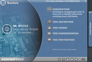
Most learners do best when there is some predictable structure that can help them make sense of material. Once we figured out the pattern of the material, we didn’t hide it from the learner. We explicitly structured our material around the pattern that allowed us to understand the complex, multi-step material. Each of the 8 modules described the fraud, gave a brief illustrative story of the fraud to frame context, and presented the consequences and the prevention.

Screen Shot 2013-01-13 at 12.08.32 PM


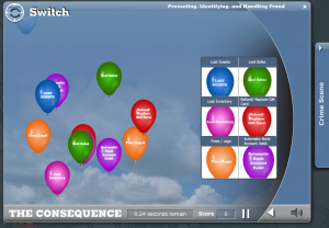
The same activity was used throughout each module to reinforce the commonalities of the consequences.

Screen Shot 2013-01-13 at 12.51.57 PM


Recognize Limitations

We were hired to do a fun, interactive game, and we delivered. But this was compliance training, and we realized that there were some very important procedural tasks that managers would have to do if they were unlikely enough to encounter fraud. We realized that having them enter a Flash game and hunt for procedures was not the best fit. We created a stand-along document with step by step instructions from corporate. There was no need to force this legal, procedural document into our crime narrative.

I find that a thorough, structural, content analysis allows me to feel confident that I have accounted for all my data, and therefore I can be creative and free when it comes to creating games and the interface.

Instructional Design Rules to Break

The world of instructional design is overrun with endless rules. Many rules are steeped in years of research and driven by appropriate learning theory. However, we think there are some rules that are OK to be bent, twisted, or broken to fit specific needs. There’s an old saying that in order to break the rules, you need to know them. In this series, we are going to take some long-lived rules of Instructional Design and discuss the when and how to break them. Agree or disagree? Let us know!

Rule #1: “Avoid Direct Instruction

Direct Instruction (DI), is the explicit teaching of a skill-set using lectures or demonstrations of the material, rather than exploratory models such as inquiry-based learning (http://en.wikipedia.org/w/index.php?title=Direct_instruction&oldid=526504905). Think of the last “training class” you sat thru while a droning facilitator dumped data from a seemingly endless PowerPoint deck. Many Instructional Designers try to avoid DI at all costs because it’s seen as old-fashioned, ineffective and didactic. Exploratory learning came along in reaction to the DI “sage on the stage” model, and has been overused to such an extent that many see it as the only way to design effective instruction. However, by rejecting DI because of assuming its leading to a poor design, we lose out on its distinct advantages.

Research tells us that learners must construct their own understanding in order to truly learn. In the real world, learners working through exploratory models often go down rabbit holes, learning valuable information and skills, but ones that may not be relevant to the task at hand. Exploratory learning is critically important when you want learners to be invested in the topic and when skills are more important than fact. But for learning data and facts, DI cannot be beat.

DI can save time and effectively transmit data, facts and procedures. We’re not arguing that DI should be used exclusively. Many learning organizations use DI exclusively (and, in our opinion, ineffectively) in the form of PowerPoint-style data dumps with little interactivity. A better model is to create an exercise that encourages the learner to explore a relevant case study, view targeted direct instruction related to the case, conduct problem-solving and reflective group work, and then finally prepare a presentation or teach-back to their peers. Don’t think you have to avoid DI at all costs, just be sure to integrate it effectively with interactive activities and exercises.

This series is co-written with Total Learner. Check back for the next rule to break: Get Buy-in From All Your Stakeholders.

On Winning

“Education” and “competition” are not usually words that are associated with each other. However, competition is an innate motivator, and humans by nature enjoy winning.

Certain aspects of winning are universal to all competitive activities, including learning. A recent Newsweek article about winning provides insight into how instructional designers can create more engaging training. The author notes that winning by itself is not the most compelling impetus, but that winning while a competitor loses is more satisfying (this would seem obvious to anyone with siblings).

Rather than using  a “task completion” metaphor, instructional designers should use a gaming and winning metaphor when designing training. Rote tasks can be made more engaging if instead of simply reading and reacting in a safe environment, the learner triumphs over a tension-filled activity. Similarly, you can provide competitive opportunities with other learners virtually.

In many K-12 situations “safe” learning environments take out so much of the excitement of competition and rating. You have an obligation to make sure every beginner learner succeeds, but you also have an obligation to groom the special talents that individuals have as well.

How do you turn cognitive tasks into challenge?

Learning objectives can remain the same, but it’s the way that it is presented that changes. You don’t have to completely redesign your training to make it more challenging. Consider these simple ideas:

Allow learners to be wrong

  • Allow and penalize for incorrect answers. If learners can complete a course by merely clicking through content, they have little reason to engage with the content. Activities that allow for “failure” can create “good tension”.

Add variable scoring

  • Reward learners for learning more difficult material by acknowledging that all content is not equal.

Add timed components for some activities

  • While not appropriate for all activities, it does create a feeling of tension.

Allow for replay opportunities

  • This reduces some of the negative aspects of the capability for “failure” allowed by other competitive components.

Create opportunities to share leaderboard scores outside of the learning environment

  • Rather than learning taking place within a silo, authentic learning events can bleed into the larger community.

A simple multiple choice game can be either boring or competitive with a simple design tweak:

Boring

  • The learner answers a question and then views the answers tagged with “correct” and “incorrect” feedback.

Competitive

  • The learner answers a question. They receive variable points based upon the correctness of the answer, difficulty of the challenge and the speed with which they answered. They are then shown their score relative to other learners. The feedback is also contextual and continues the gameplay.

Take some lessons from this short quiz. How many times did you feel compelled to play?

A version of this post appeared on The Total Learner Experience

Don’t be Half-Assessed

Assessment is used to measure learning outcomes, but if you see it only as a testing tool you’re missing half its value. Assessment should not be punitive; it should uncover the learner’s strengths and help identify areas for improvement. Well planned and integrated assessment creates opportunities for learners to reflect on their learning, apply new skills and knowledge, and also enables the institution to recognize the value on the learning intervention. Adapting existing models can take you much further than re-creating the wheel. In this post, we examine some guiding principles for effective assessment.

An excellent example of assessment as a way to support learning goals is Adobe’s Certified Associate practice tests. Learners can take a certification exam without any structured practice, but there is also an unlimited certification prep test package. The practice test closely mimics the structure of the final exam. Both combine multiple choice questions and simulations of the Adobe environment. The multiple choice questions require the learner to demonstrate knowledge of design concepts and the production process. The simulations require the learner to complete a task within the simulated software application interface. Keyboard shortcuts are disabled, but otherwise, learners can use any correct method they choose to complete the task, using menus or panels as appropriate.

Another good example is the Sun (now Oracle) Java certification paths. Each path contains a test prep “kit” that includes preparation recommendations, additional resources, a practice test, and a re-take policy. Each path is designed to prepare the learner to achieve a specific level of certification, and used as a benchmark against industry standards. These certifications are recognized by employers and can advance a person in their career.

Accreditation or certification can be used to validate mastery of a topic, but this is not the only way that assessment can be useful. By seeing assessment an integral part of instruction, we can support the learner’s career development while measuring true performance for the business.

Factors that make an ASSESSMENT tool also a useful INSTRUCTIONAL tool are:

  • Authenticity
    • The learner performs the task in context, not recalling theory, but actually demonstrating competency.
  • Open ended
    • Because the end product is assessed, not the method used to get there, learners are able to use whatever menus or panels they choose.
  • Learning while doing
    • Learners use contextual clues and critical thinking to complete tasks. They may not know how to adjust alpha levels in Photoshop, but they may know to investigate the color panel to find them.
  • Self-reporting
    • Learners can mark questions that they’d like to return to if they have time or opportunity.
  • Cumulative time
    • The test is timed with one master clock, not with individual times for certain sections or items.
  • Feedback
    • Learners receive feedback on each item, with notes about the correct answer.
  • Tracking
    • Performance from one practice test to another is tracked.

Assessment is not something that should only occur in a testing situation, indicating pass/fail rates, but it should be integrated throughout instruction to allow the learner to know how they are doing, so they can learn more effectively. You don’t want your learner to leave half-assessed!

A version of this post originally appeared in The Total Learner Experience in August 2011.

Microsoft’s Digital Literacy Curriculum Sucks. Surprised?

I originally posted this in May of 2009. 

I work as a program director for a non-profit devoted to mentoring and tech literacy in low income 7-12 graders. As such, I am often looking for useful curriculum related to a wide variety of programs, tasks and skills. I am often in debate with myself and others if it is better to provide the students with practical skills related to secretarial-type work or to explore the outer boundaries with projects in graphics, animation and web design. Our approach is to focus on allowing students to explore and produce with the more creative software while providing auxiliary work with students who see the value of learning the more practical Office suite.

Not wishing to reinvent the wheel, I regularly look for clear, self-directed lessons suited for my students. Oh, and free or cheap, because we’re a non-profit. I’ve looked at Microsoft’s Digital Literacy Curriculum several times to see if we can use it to demonstrate proficiency. Now I can hear some of my techie friends slapping themselves in the head, about to eviscerate me because I even mention the Evil Empire. Let me introduce you to the real world outside of your basement and Silicon Valley. Most people out here in the light, don’t care or know about Open Source. They are just grateful that they can reliably turn on their computer and spit out some information. Their focus is on their work, not arguing about the benefits of Ubuntu versus Morphix.

Back to the Digital Literacy Curriculum, it sucks. No surprise there, it is a Microsoft product. Now I know I am late to the bandwagon, but I’ve still got to pile on. Everything about Microsoft sucks. I am a native proud Mac user, but practicality has required me to have a fairly good working knowledge of the Windows world. I work with Microsoft as a recipient of donated software and OSs as part of our non-profit work. Each month when I need to report our usage I curse in my head. It’s almost as though they take pride in having an interface that is clunky and unusable. For a company that’s flush with capital they sure are stingy with any ease of use or follow through to their systems.  The Digital Literacy Curriculum reflects this attitude. It’s almost as though Microsoft is full of idea-men with no one to come back to ensure quality control. hmmmm….

I’ve looked at it before at work, but I wanted to give it a more detailed fish eye if I was going to record my impressions. Here on my mac computer I cannot even log into their curriculum because I don’t have Internet Explorer. Really, I mean, really? Can Microsoft not see the writing on the wall. Nevermind that I’m on a Mac. What about all those people out there who are using Firefox or Chrome? (Too bad I can’t round out that list with Netscape… I like 3s.) Why is it that they are so dead set on protecting their product that they cannot break their walls of paranoia and protectionism to become more welcoming and user friendly?

24 hours later…I had to reinstall IE, or maybe I didn’t. It had been set to “work offline” which took a while to find. They have two tools pulldown menus that do not have the same functionality. It would be cooler to pretend like I don’t have “user error” issues.  Everyone has user error issues; those of us with healthy self-image can own it. Anyway, accessed the curriculum at long last.

I was disappointed. After all my sturm und drang getting it set up, it wasn’t horrible, it was just typically boring. A metallic voice read some prose to me; the sound screeched through my veins like fingernails on chalkboard. There was a lot of tasteful blue and gray on white. It was just dull. And basic. Now, I do have to consider the fact that this is designed for neophytes, people who still need basic computer skills. Just because people are ignorant shouldn’t mean that they should get bad training; that’s perhaps one reason that they are ignorant in the first place.

This material is clearly not current, and likely I shouldn’t even be wasting breath on it. The last update was October 2007 which is so last century in Internet terms. Except it’s not. I get emails regularly from Microsoft touting this curriculum. They just sent me another disk encouraging me to use it with my clients. More of the same didactic lecture and demonstration that is already failing learners all over.

–Dolly

Suck Quotient– 2

usability 1 the actual content was fine, getting to it was an exercise in perseverance and patience.
aesthetics 2 non offensive
innovation 1 no
accuracy 4 the content was correct, just dull
fun 0 none

**Note
I was going to look at version 2 to be all fair and balanced, but while it worked when I first accessed it, once I installed the add ons that Microsoft recommended, I ended up with a black screen, no content. You win, Microsoft!

Prior Knowledge and Proper Leveling

This post first appeared in June 2009.

Yesterday I spent a long time ensconced with Lynda.com working through ActionScripting 3.0 for Flash. Now, I’m not a super-sophisticated Flash user or ActionScripting writer, but I know my way around. If you don’t know Lynda’s training, they structure the courses through a series of 2-5 minute long screen capture videos with voice over. The courses do not offer clearly stated prerequisite knowledge and I wasted long minutes watching videos defining variables, functions and repetitive syntax. I work from the assumption that most people who are working with a particularly specific programming language through an expensive subscription tutorial service likely know what a variable is.

I wouldn’t even be complaining about the slow step by step nature of the lessons if it weren’t that when they got to the portion that I wanted to know, interactive buttons, it suddenly fast-forwarded adding multiple concepts all at once. After overexplaining basic syntax, it underexplained a multi-layer, multi-movieclip while purportedly teaching how to make a button work. Rather than demonstrating how to control action in a simple, reusable manner, they instead embedded it within a much more complex framework, which makes it difficult for this user to transfer it to her own purposes.

So after suffering through information that was overly basic, I was then overwhelmed by the complexity of the next lessons. I had a similar experience at a four day FileMaker Pro training session. The first day was review for me. The instructor went over database structure — topics like “one to many relationships”. I must mention that there were only 2 people in this training, both of whom had a fair bit database experience. Neither of us needed hours of discussion of fields, tables and relationships. Day 2 was moderately useful. The information covered was graspable. Day 3 and 4 however were pure torture. We breezed through layers of proprietary knowledge that was highly specific and highly detailed.

Throughout the four days I kept wondering, who is this training for? There was no database manager who could find all four days useful. I “earned” a certificate, but I didn’t feel like I was well-served by the 28 hours that I sat in that room.

The missing component in both these experiences was the acknowledgment that these skills would not come until we had time to practice them. There was no time for reflection or synthesis built in or encouraged by these training experiences. I understand the culture that creates training like this, but I think it’s wrong-headed to omit time for people to actually ingest what they are “learning”.

Using Social Media in Sales Training

More from the archives. This originally was posted in November 2009 on The Total Learner Experience

This post is a “conversation” held in Google Wave between Dolly Joseph and Brandon Carson (two of our bloggers). Until we can embed actual waves in this blog platform, we will copy-and-paste interesting back-and-forth dialog.

Bwc BRANDON: Typical sales training provides principles, criteria, and process for making the sale. In many instances a a video demonstrating the optimum application of those factors is what is used to try and achieve behavior change. These videos are primarily from the viewpoint of the expert, however. Why not try using social media applications to provide two more perspectives: that of the salesperson being trained, and that of the customer receiving the sales pitch?

Drj DOLLY: Why not use a game? I have some recollection of some game (perhaps from The Sims) as you did different actions you got rapid feedback– so as your avatar smiled or said the other character’s name you earned points, but as you gave negative feedback you would lose those points. How about if as a sales person you didn’t know what the other customer wanted exactly. It’s part of the salesperson/player to figure it out– what their trigger points are. In a sense it’s a sophisticated 20 questions.

Bwc BRANDON: Good point. I like the idea of making it more game-like.

Drj DOLLY: What would be motivating game rewards for sales people? Would they need to IRL rewards, or could they be contained with a larger game framework?

Bwc BRANDON: Sales people have a small window of patience for “games”. However, they do thrive on competition and “winning”. I think reward can be as simple as executive/leadership recognition all the way to financial compensation. A competitive game arcade was used at Intuit as a sales education tool, and the primary reward mechanism was simply the leaderboard and a “weekly top scorer” notification that was sent out to everyone in the sales organization.

Drj DOLLY: Maybe they could earn vacation time. That would be motivating for me. ;). I could see this being a great tool for new hires who don’t have a great deal of sales experience.

Bwc BRANDON: Exactly. The first video can serve as the model. Modeling behavior from the perspective of an expert is a great way to demonstrate to the learner the expected outcomes. New hires need scaffolding to help them practice and understand the complex skills needed for mastery.

Drj DOLLY: Well if we are trying to promote peer to peer learning, then the salespeople should upload their own suggestions or trials. Is there a way for them to do this?

Bwc BRANDON: Sure! Successful salespeople could record their own responses. Have the learner use a webcam or Flipcam to provide their response. Have them upload the response to a video community (YouTube, or an internal “video-on-demand” platform if you have it). Using social media utilities such as ratings and comments, the cohort of learners can view each other’s responses and provide feedback. The experts can also view and rate the practice videos and provide their input as well.

Drj DOLLY: Salespeople who upload videos can receive points. More experienced salespeople could mentor new hires and receive points. If it’s modeled like YouTube, then the more views or comments you get, the more points you get. Of course what we are describing is a closed circuit. You’re not getting any input from the actual customer base.

Bwc BRANDON: Another video can provide perspectives from the client receiving the sales pitch. You can consider using actual customers who have viewed the first and second videos, or you can assemble “actors” and use case studies from the field. I would think it’s key to use real-life experiences whenever possible. Authenticity is a key factor in this type of activity. This unlimited back-and-forth between learners, experts, and even customers provides practice opportunities not possible in a classroom.

Drj DOLLY: What if the best videos became part of the companies marketing plan? Spotlight on top performers. The game makes a genuine leap to real life.

Bwc BRANDON: Great idea! I like that.

10 Ways to Use Facebook for Training

This post first appeared in December 2009 on The Total Learner Experience. Although dated, I think it still has value. 

Bwc Brandon: You know as I work to create social learning micro-sites on the internal corporate network, it sometimes hits me that in a lot of ways I’m just re-creating what Facebook has already hit a home run with. So, Dolly, the question for you today is: How can I leverage Facebook for training?

DrjDolly: What content is best suited for Facebook? Is Facebook for content or is it for social networking and engagement?

Bwc Well it seems that technical training, soft skills training… really any type of learning content would work. The power of the platform seems to be around the integration of peer-to-peer dialogue and sharing with the context of learning. Facebook users are collaborating by default because they are exchanging comments and creating dialogue interactively. What we need to do is make this engaging activity applicable to work/training.

Drj Shall we brainstorm? What are the features of Facebook are conducive to training?

Bwc OK, so let’s make it a contest. Let’s list 10 ways we can use Facebook for training. I mean we’re professionals right? With imaginations like ours, we should be able to easily list 10 ways! Here’s one way:

1. Discussion threads. People seem to love engaging in dialogue about relevant subjects. A simple discussion board functionality is key in attracting learners to a higher level of engagement.

DrjFacebook recently took out the updates about when people commented on others’ walls. I liked that and was sad to see it go. It allowed me to see what my friends were saying — even if it was directly relevant to me AND it often introduced me to new people that I liked. You never know what tidbit of seeming off-topic information will inspire a new idea.

Bwc  2. Class notes and links to supporting information. In academic settings I’ve seen many professors, trainers and facilitators add their syllabi, notes, and links to websites. I’m using Microsoft Sharepoint now to create a wiki where I will host pre-work content and activities for a workshop I am designing. A Facebook-like platform is great for this, although versioning control would be a nice-to-have.

Drj Sharepoint?

Bwc Sharepoint is Microsoft’s collaboration platform. A lot of people are using it for collaborative learning environments. Check out more about it here.

Drj 3. Course feedback. Students can provide feedback about their favorite or least favorite aspects of the training.

Bwc This is where a “two-way” information stream can provide excellent near real-time feedback. An instructional designer could easily move to a more “agile” design process by using Facebook’s social utilities to gain “instant” feedback on instructional content. I’ve been using similar methods for several years by building database systems. Facebook has this functionality built in!

Drj

4. Student Reflection. Students are required to post some “takeaway” from any training that they just completed in their status, which can help their community at large.

5. Events. If you can get out of the whole departmental competition thing, it could be really interesting to have online “events” that everyone was invited to facilitate cross-company brainstorming for new initiatives.

Bwc 6. Build your personal network/brand. It’s important for individuals to be able to broadcast their expertise and interests. Facebook-like platforms could become similar to an “auctioning” of skills. IBM does this now with their internal Blue Pages. Employees are encouraged to list their skills, expertise, and availability. People can search using keywords to find suitable candidates for their projects.

Drj I like this idea. We haven’t talked about LinkedIn, but it seems like this might be an internal version of that.

Bwc 7. Post-classroom events (extended learning). We used this recently on a leadership training program. Although the primary component of the training course was a 3-day classroom experience, we designed pre-work activities for the cohort to participate in online, and, to ensure retention and reflection we also designed post-classroom activities. The cohort remained engaged, and continued to work on the post-class activities. One benefit were the “breadcrumbs” left behind by the cohorts… subsequent cohorts could learn from them.

Drj  8. Games. We could do a post of different types of games. But clearly all sorts of games are popular on Facebook. I don’t play, but I know that Mafia Wars, Farmville and the like have some real appeal. I could see seeking out people who had certain skill sets to form your teams. You and I play Scrabble and its knockoffs. Facebook serves as a portal to every kind of game imaginable. I could also see some scavenger hunts for content and personnel.

Bwc How many games on Facebook are designed for learning though? Quite a few I think… it’s just not real obvious.

Drj I FIRMLY believe that every activity people participate in teaches or reinforces some learning or knowledge (even if only a physical response). Even if games are not designed with education/instruction/learning in mind, they still have features that can be exploited and minded to fold in formal/planned learning opportunities. I mean, somehow they have made the most inane, tedious tasks on Farmville completely compelling. Who knew? Which leads me to think about another way to use Facebook for training:

9. Quizzes. What kind of programmer are you? What does your desk say about you? What kind of cubicle mate are you? While these are humorous, I could see some actual useful ones, like providing Myers Briggs profiles and the like. Oh, and here’s the 10th (I beat you to it)!

10. Fandom. I was interested to see that the number one corporate identity on Facebook is Coke. Their presence was first created by a zealous fan. The page has become their corporate identity, and hugely popular. A lot of times employees can be the biggest fans of a company and hold the most knowledge. Creating a safe environment to tell the positives of the company can offset some of the griping that we all need to do sometimes.

Bwc Yes, but some companies are paranoid about their “intellectual property” being made public. It’s akin to the music companies obsessing over DRM — the one thing a company needs to understand about today’s information revolution: you can’t control everything … so focus on influence rather than control. Comcast learned this quickly, and adopted Twitter to broadcast network statuses to its customers. Now it uses Twitter for customer support.

Drj  I see we keep returning to the theme that companies need to have a more flexibility in this era of accessible info.

Bwc Well there are 10 ways… but there are many more. The big question for companies: are you going to build internal social platforms, or leverage the public ones? It seems like many companies will want to keep their social networks behind their firewalls. This may work in the short-run, but newer generations of workers (Millennials and the 2020 Gen) will want to be able to blend their public and work networks and profiles. That will make for an interesting dialog… maybe we can discuss that one soon?

What’s the Difference Between a Game and an Educational Game?

Back in 2009, Google Wave was the next big thing.  Dolly and Brandon used it to discuss their opinions on the difference between a game and an educational game. The distinctions are key for instructional designers to consider when deciding to design a game for a learning intervention.

Drj DOLLY: Games vs. educational games. I know, one’s fun and the other one is not! Really, though, what are the differences? I think intentionality of design is a key point, because I think that all games — indeed all experiences — are educational. Bernie deKoven talks a lot about children’s games providing an opportunity to roleplay and work out developmental issues. I know I learned a lot about what a ruthless sort my brother is when he beat me repeatedly at every board game created. So, if we accept that every game has learning opportunities, how do we make sure to include the fun?

Bwc BRANDON: Both can be fun, right? The basic difference is an educational game is designed with specific learning objectives and should be able to assess whether learning occurs.

Drj

I think assessment is key. That’s the external component that is often artificial. So many times assessment of learning within games have two basic problems:

  1. It’s completely external and separate from the game play.
  2. It’s too “safe”– Alex Trebek doesn’t give you second chances in final jeopardy. It’s FINAL!

I was thinking about that whole shift in board games with the advent of Cranium. Their whole goal was to remove the idea that there was one winner who had all the fun, but that players of multiple intelligences could play and those people could have fun. Bonding, instead of board throwing!
Bwc Hmm… Good point — Cranium could be looked at as a “learning game” although it doesn’t have traditional learning objectives, right?

Drj Well, if you look at their objectives they are met. And their learning objectives fall nicely within affective measures and an arts curriculum.

Bwc For example?

Drj Well, the goals of the game include team cooperation and communication through graphic arts and music.

Bwc “Game” is such a broad term. A game must include some element of Play, I presume. I also assume a game designed with a learning outcome in mind has structured play (as opposed to unstructured play — like when a kid plays with blocks).

Drj Garvey said that a game is institutionalized play. Look at football. It’s a game, clearly. We wouldn’t say that it’s educational, but you can learn it (and those who learn it best find it financially rewarding). Also by using it as a metaphor you can teach life lessons and/or management strategies, or you can teach math from the stats of the game.

Bwc So this leads me to think about the “game perimeter”. Most games have boundaries, right? We step into the perimeter’s “magic circle” to play the game. In the corporate workplace, the “magic circle” is the game’s play boundary the instructional designer/game designer creates. The trick for instructional designers is to craft what learning occurs while the player is in that circle… so does that mean that the assessment needs to occur inside or outside the perimeter?

Drj I think the best assessments are seamless and inside that perimeter. Examples could be performance-, point- or victory-based.

Bwc So are we saying that the differences between a game and a successful educational game can be minimal if assessment can be more embedded and genuine?

Drj Sure.